
Featured IBDA 2023
Creating Enduring Brands: ABND wins India’s Best Design 2023
ABND was founded in 2010 with a simple aim to help clients build purposeful and profitable brands that live up to their values, engage their customers and win the business. They do this by creating meaningful brands that matter at every stage of their lifecycle: from ideation through to evolution, change management and beyond. The Practice aims to break silos between design and strategy, brands and businesses. As brand practitioners ABND strive to be creative, collaborative and are passionate about everything we do. They turn new ideas into real business results through integrated design and strategy teams. Over their 13 years of market presence, they have catered to brands across all segments and industries.
Project 1 – Tenneo and Ozemio
G-Cube Software Pvt. Ltd., a 25-year veteran in Learning Management Solutions, was acquired by MRCC Group and split into two distinct brands: Tenneo and Ozemio. The foundation of both brands was driven by in-depth industry immersions, product and service understanding workshops, category analysis, and client research.
Tenneo focused on product-centric offerings, providing LMS and LPP solutions to various industries. It was positioned as a Seamless Integrator with platforms that seamlessly integrate with clients’ needs. On the other hand, Ozemio was positioned as a Talent Transformation Consultancy, emphasizing its human-centric approach and offering transformative solutions.
To ensure brand equity for MRCC Group, the identities of Tenneo and Ozemio were designed to be distinct yet interconnected. The logos incorporated the letter “O” as an integrated symbol, with Tenneo’s representing a seamless fit like a puzzle and Ozemio’s conveying upliftment and care.
Project 2 – Evonith
Following Nithia Capital’s acquisition of Uttam Steel Value Limited, the establishment of a new brand, Evonith, was necessitated to align with identified business objectives. A comprehensive series of internal workshops and analysis was undertaken to meticulously craft the brand’s positioning and strategy, which revolved around the resolute mission statement, “Here for all.”
The name Evonith was coined by combining “evo” from evolution and “Nith” from Nithia, a term signifying eternity. Through this amalgamation, Evonith epitomises the notion of perpetual advancement and progress.
The brand identity was intricately derived from this core concept, manifesting as the ‘tripeaks.’ Each peak symbolizes distinct levels of impact that the organization engenders, both for its stakeholders and for society. In choosing the brand colour, orange was identified to differentiate Evonith within a sector largely characterised by blues and greens.

Project 3 – Coserve
Coserve Solutions is IT solutions company that specialises in the digitalisation of complex processes associated with Industry 4.0. To establish itself as a leader in the industry, Coserve Solutions partnered with ABND. This collaboration aimed to effectively showcase Coserve’s technological expertise, application capabilities, and service portfolio.
ABND conducted a series of workshops, virtual research, competition analysis, and category analysis on a large scale. The brand strategy was devised to emphasise Coserve’s deep understanding of its domain, coupled with a competitive edge, which was encapsulated in the concept of “Thoughtful Transformation.” By blending technology with a human touch, the brand essence was crafted as “Simplifying Transformation with a humanizing experience.” The Brand Identity visually represents this essence through an abstract depiction of two hands coming together to form the letter ‘O,’ symbolizing symbiosis.
The continuity within the letter ‘O’ also signifies the notion of transformation and the journey from the past to the future. The brand colours were carefully chosen to evoke a sense of formality, while maintaining a balanced representation of growth, trust, and transparency.
Project 4 – Norsmiths
Norsmiths, the leading mining solutions company in the Kirkland Lake region of Canada, distinguishes itself as the sole provider of cutting-edge drill bit reconditioning services and problem-solving solutions for local gold mines, mining contractors, and drilling companies within a radius of over 200 kilometres. ABND studied the business ethos and objectives of the organisation to establish a strong foundation for the brand. They recognised Norsmith’s deep commitment to the community and desire to empower local residents.
The brand was conceived to be driven by the expertise and passion of individuals residing in proximity to the abundant gold deposits in Kirkland Lake. The brand concept was rooted in the idea of Kirkland Lake being the heart of the mining industry, extending its influence to neighbouring cities and even other countries.
This notion is reflected in the brand name, “Norsmiths,” which combines “North” and “experts,” showcasing the brand’s regional expertise. The accompanying logo reinforces the belief that even small sparks can ignite significant change. It features an upward arrow adorned with sparks, depicting progress and innovation. The choice of a vibrant red colour not only aligns with the passionate spirit of Kirkland Lake but also pays homage to the region’s rich mining heritage.
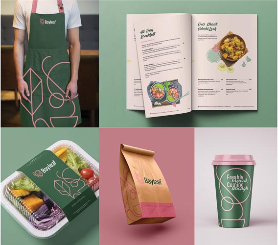
Project 5 – Bayleaf Café
T-Leaf Services approached ABND with the task of creating a compelling brand identity and visual system for their inaugural venture in the hospitality industry, Bayleaf Café. As seasoned franchise owners, they recognised the need for an unbiased and distinctive approach in establishing their own café from scratch. To fulfil this objective, ABND conducted thorough market research and consumer analysis, collaborated with the architecture, head chef, and considered the unique aspects of the restaurant’s geographical location.
Understanding that a restaurant encompasses more than just food but also provides an immersive experience for guests, the studio focused on developing an identity that encapsulates the essence of food, relaxation, and rejuvenation. Elements such as waves, sun, moon, aroma, steam, and, of course, the bay leaf were intricately woven into the visual identity.
This deliberate integration of these elements ensured that the brand identity of Bayleaf Café remained true to its core attributes while simultaneously standing out amidst the crowded restaurant landscape. To further enhance the brand’s visual appeal, they identified pastel pink and deep green as the primary colours, symbolizing the serenity of the geographical location and reinforcing the brand’s distinct personality.
Credit: ABND