Featured IBDA 2023
Revitalising Freshness: Groovy Plus Packaging is India’s Best Design Project 2023

After the massive success of Groovy fruit drinks across North India in 2020, Groovy was set to take things to the next level with Groovy Plus, a fruit juice with more fruit content. The new version is even more natural and healthier than the original Groovy fruit drink.
Capturing Nature’s Essence in Every Sip
The primary challenge was to create packaging that was more attractive and impactful than the original Groovy Drinks. The goal was to reflect the brand’s closeness to nature and highlight the increased fruit content through the packaging design.

Bold and Bright: Standing Out on the Shelves
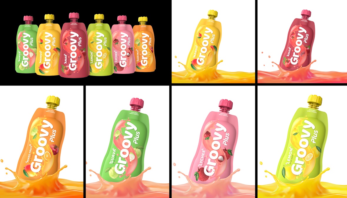
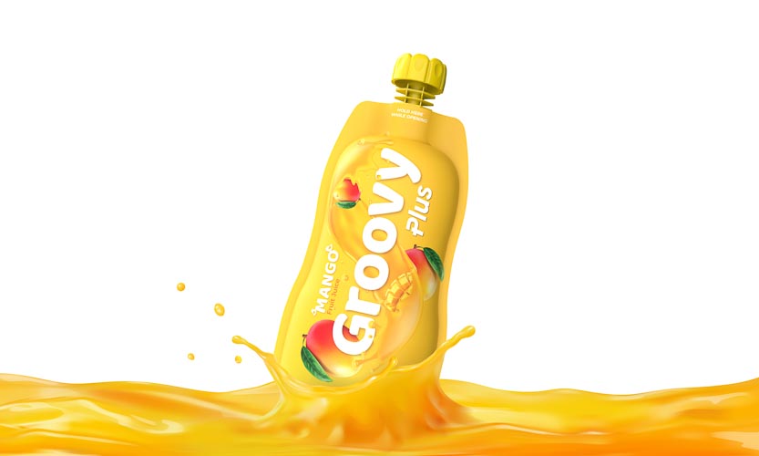
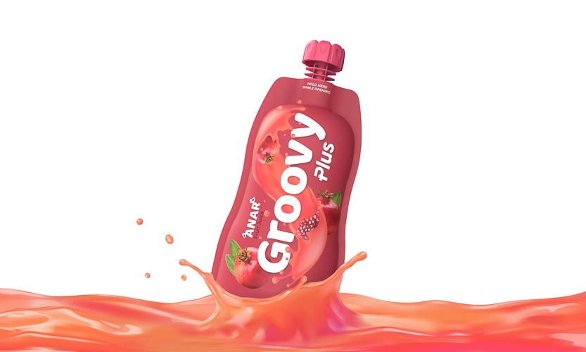
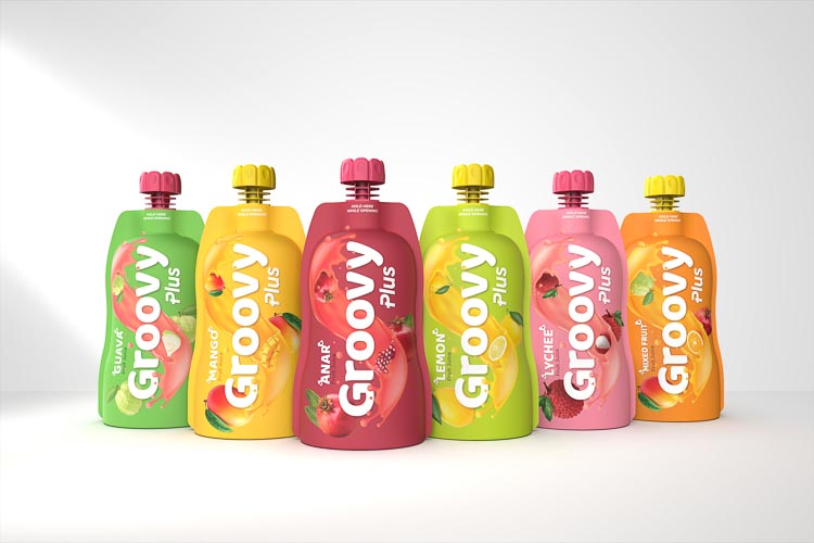
The new packaging for Groovy Plus is a burst of freshness and vibrancy that perfectly captures the essence of the delicious and nutritious fruit juices contained within. The design features a clean and modern aesthetic with a playful twist, incorporating bold typography and bright colours to represent the diverse range of fruits used. The use of contrasting colours and bold typography creates a visually captivating effect that stands out on the shelves, making the product instantly recognisable and enticing to potential customers. Additionally, an extra layer of safety was added through anti-choke caps to protect young children.

The Success of Groovy Plus
Following an internal soft launch targeted at the intended audience, Groovy Plus was picked up twice as often as the original Groovy Drinks. This significant increase in consumer interest demonstrates the effectiveness of the new packaging design in making the product more appealing and in line with its natural, fruit-rich identity.

Credit: Rebase Design

