
Featured IBDA 2023
Packaging a Brand’s Essence: Almond Branding is India’s Best Design Studio 2023
With a passionate team of Planners, Strategists & Creators and an experience of more than a decade, Almond is a Strategic Branding & Design Agency that has been working with leading companies like Amul, Marico, 3M, ITC, Dabur, Kellogg’s and Tata, to name a few. The team at Almond just loves Packaging Design! It believes that Packaging requires a lot of detailing and is not everyone’s cup of tea. With holistic experience of printing and packaging, Almond is known by most clients as the Packaging Design experts. The brand footprint is such that you can’t walk into a FMCG retail store in India that doesn’t have Almond’s design work displayed on the shelves.
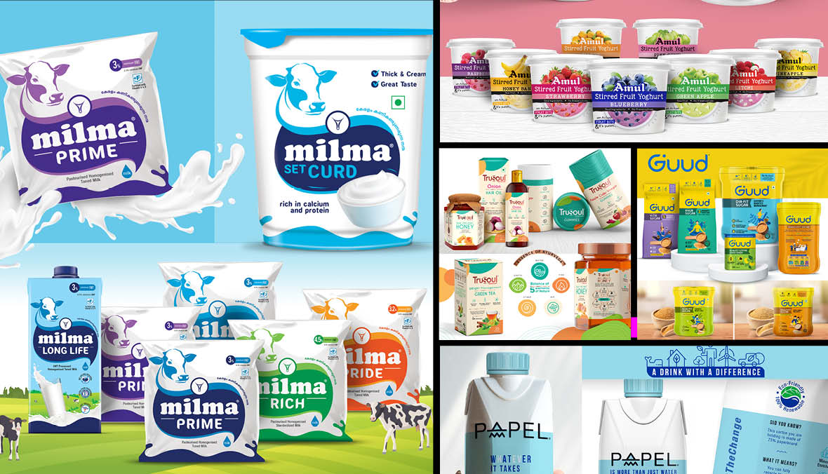
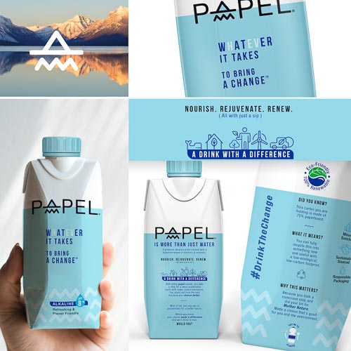
Project 1 – Papel – Water in a Plastic-free Packaging
The brand Papel was trying something that’s not been done before. The Big Idea was to bring about a change. From the choice of the compassionate pastel blue to the black capturing the “here to make an impact” attitude to the forms of the logo identity, everything depicts planet friendliness at its core. The primary hurdle was the regulatory restriction on the use of the term “water” in any non- transparent context. However, through a clever combination of captivating copy and carefully chosen typography, the design effectively communicates the potential for water to bring about positive change. The brand’s sustainable mission is reflected well in its design language.
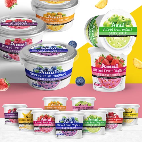
Project 2 – Amul – Packaging Design for Fruit Yogurt
Amul was a late entrant in the Fruit Yoghurt category and hence needed a packaging that would capture eyeballs. The idea was to create a design that was simple yet impactful, featuring a prominent band that showcased the product branding and variants consistently across the entire range. The product had real fruit bits. The design brilliantly captured this essence with half a bowl of fruit yoghurt while the other half on top was depiction of actual fruit conveying that it was as good as enjoying the real fruit flavours of your choice. The overall output exuded vibrancy and youthfulness, leading to increased product visibility and higher sales on store shelves.
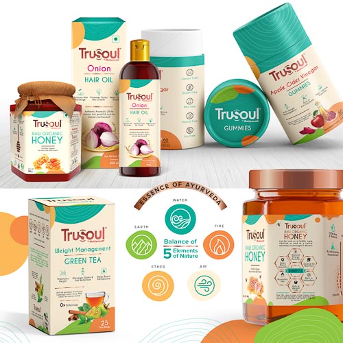
Project 3 – TruSoul – Harmonising the Five Elements
Baidyanath, renowned for its century-old wisdom and expertise in Ayurveda, sought to introduce a modern, easily accessible, and contemporary brand called TruSoul. The Brand essence revolves around the ancient science which brings five elements in harmony for holistic health. The TruSoul Packaging captures this essence of bringing the balance between the five elements. This inspiration is translated into every aspect including the packaging’s colour scheme. The layout flows freely, with a beige backdrop serving as a formidable canvas for the other elements to shine, while the prominent brand colour, turquoise, creates a focal point.
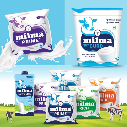
Project 4 – Milma Prime
Milma discovered that although it was highly regarded for its quality, it lacked vibrancy and relevance, which led to a decline in consumer confidence. The need of the hour was to establish a unified identity with consistent taste, quality, and brand imagery across the entire state. A strong Visual Architecture was meticulously crafted that would tie the entire family together, drawing inspiration from the sacred cow, which is central to the philosophy of Milma. The visual hook was a benevolent-looking holy cow gazing back at the consumer, embodying the brand’s essence of care and concern for loved ones and deep respect for values. The overall design embraces a clean and minimalistic approach, symbolizing freshness and purity— two essential attributes within the category.
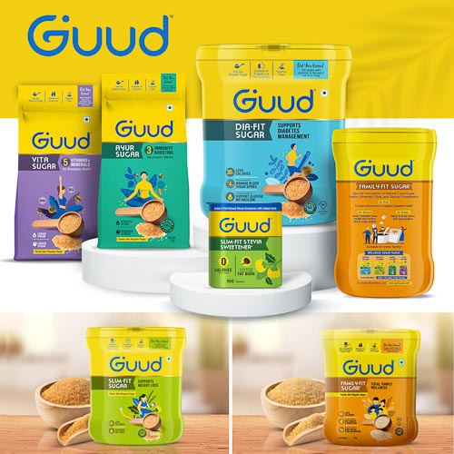
Project 5 – Guud
Patrika Wellness embarked on a venture into the FMCG market with a range of value-added sugars, introducing the brand GUUD with a vision to simplify healthy living. The objective of Packaging was to build a distinctive and credible (health & wellness credentials) look to compete in the domestic and international markets. The key challenge was to make the packaging straddle multiple price tiers (from Popular+ to Premium) without alienating the consumer segments. Since it was an innovative offering, a lot of science had to communicated as RTBs but was done in smart infographic style along with category codes that connote wellness.
Credit: Almond Branding